Configuring Multiple Filters Line Chart (Days of Week) Macro
Renamed from (Weekly) to (Days of Week).
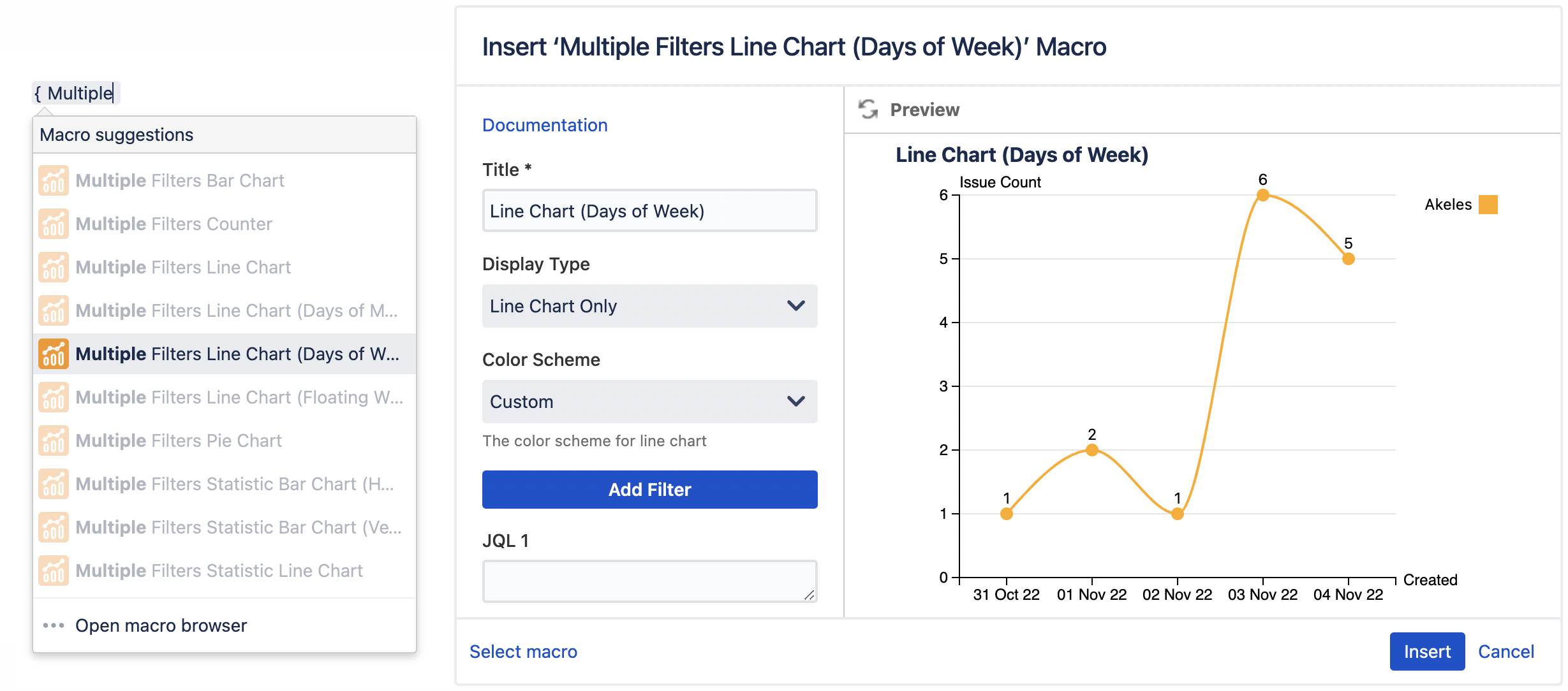
Settings | Default | Description | |
|---|---|---|---|
Title | Line Chart (Days of Week) | The title of the macro | |
Display Type | Line Chart Only | The types of data to display:
| |
Color Scheme | Basic | The color scheme for line chart:
| |
Add Filter | Click to add filter *Maximum of 12 filters | ||
JQL n | Enter JQL to get the Jira issues | ||
Alias n | The display name for JQL n | ||
Date n | Created | The date field for JQL n:
| |
Calculation Mode n | Issue Count | The calculation mode for JQL n:
| The operator:
*Not applicable for Issue Count |
Color n | The line color for JQL n *Configurable only if Color Scheme is set to Custom | ||
Display Time In | Hours | The unit to display time in:
*Applicable for Time Fields only (e.g. Time Spent) | |
Cumulative Mode | No | Whether to display cumulative data over time:
| |
Week Span | Current Week | The week span to plot:
| |
First Day of Week | Sunday | The first day of the week:
| |
Days to Display | 7 Days | The number of days to display:
| |
Display Full Year | No | Whether to display all 4 digits of the year (e.g. 2008):
| |
Sort | Date ascending | Sort the dates in ascending or descending order:
| |
X-Axis Label | Created | The x-axis label for the chart | |
Y-Axis Label | Issue Count | The y-axis label for the chart | |
Display Mode | Side By Side | How the lines should be displayed:
| |
Interpolation | Linear | The method of curve fitting:
| |
Data Labels | Show | Whether to show/hide the value above each dot:
| |
Tick Interval | The interval between each tick on the y-axis | ||
Reference Line | Enter a value to display the reference line Click on the colored square to select color | The style of the reference line:
| |
Table Orientation | Vertical | Whether to display filters horizontally or vertically:
| |
Table Totals | Hide | The totals for each column and row:
| |