Configuring Multiple Filters Bar Chart Gadget
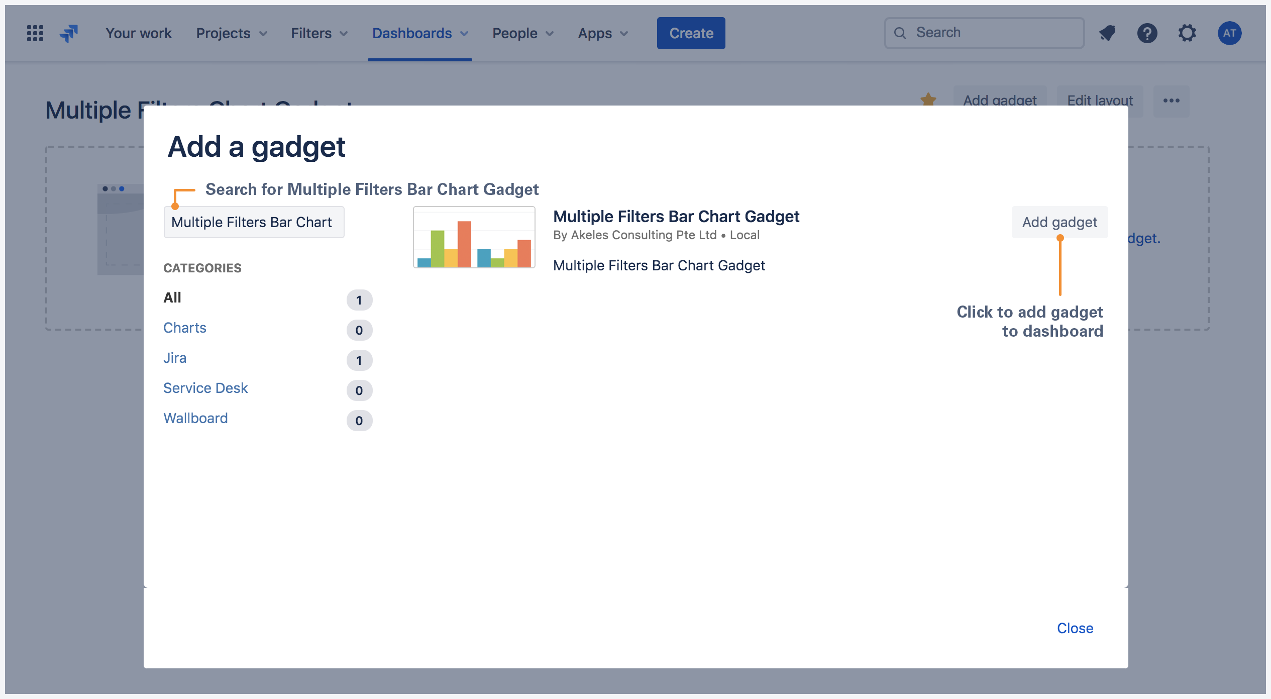
Adding Multiple Filters Bar Chart Gadget to a dashboard
- Go to a dashboard and click on Add gadget.
- Search for Multiple Filters Bar Chart Gadget and click on Add gadget next to it.
Multiple Filters Bar Chart Gadget configuration
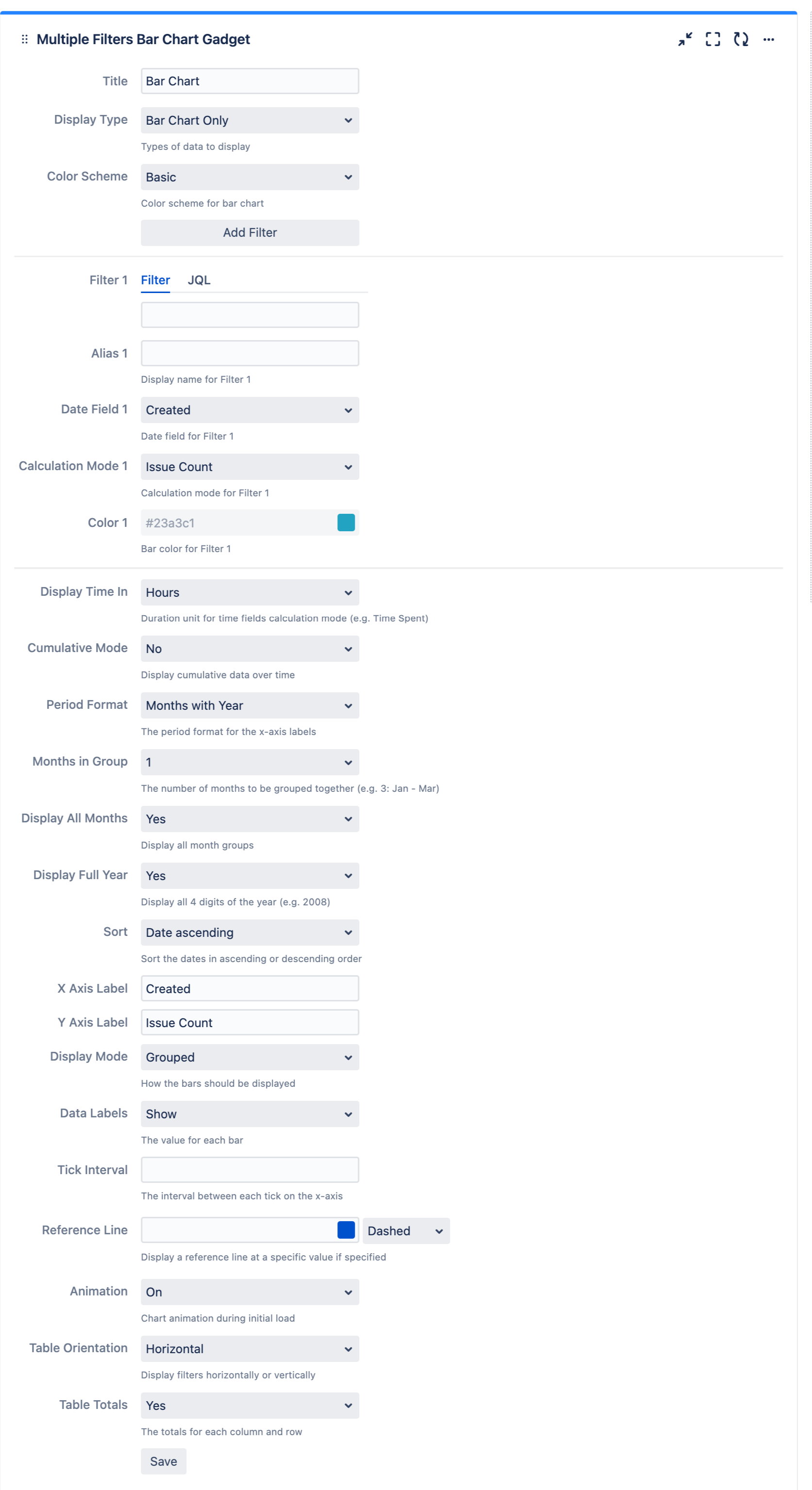
| Settings | Description | Default |
|---|---|---|
| Title | The title of the gadget | |
X Axis Label | The x-axis label for the bar chart | Created |
| Y Axis Label | The y-axis label for the bar chart | Issue Count |
| Color Scheme | Select the color scheme for the bar chart
| Basic |
| Add Filter | Click to add filter *Up to 12 filters can be added | |
| Filter n | Select the filter(s) or enter JQL to plot the bar chart. | |
| Alias n | Display name for Filter n | |
| Date Field n | Date field for Filter n | |
| Calculation Mode n | Calculation mode for Filter n | |
| Color n | Bar color for Filter n | |
| Period Format | Select the period format of the x-axis labels
| Months with Year |
| Months in Group | Select number of months to group together (e.g. 3: Jan - Mar)
| 1 |
| Display All Months | Select whether to display all month groups
| Yes |
| Display Full Year | Select whether to display full year (e.g. 2008)
| Yes |
| Display Type | Select whether to display bar chart, data table or both
| Bar Chart Only |
| Display Mode | Select whether to group or stack the bars
| Grouped |
| Data Labels | Select whether to show/hide data labels in bar chart
| Show |
| Display Time In | Select the duration unit for time fields calculation mode (e.g. Time Spent)
| Hours |
| Sum Up Rows | Select whether to sum up rows in data table
| Yes |
| Chart Mode | Select how the data should be calculated over time
| Normal |
| Tick Interval | Specify the interval between each tick on the y-axis |